
PROPOSAL
Broody Hen is the perfect place for folks looking for a convenient yet worth-while breakfast option in Brooklyn, New York. As such, people in this market need a place like Broody Hen that can reliably offer quick and easy yet affordable options for a meal or quick bite. It consists of baked goods such as bagels, cookies, muffins, or café-style beverages including coffees and teas on top of more hearty meal options like breakfast sandwiches, wraps, or bowls.
To make sure they appeal to a wide audience, they focus on trends consumers may look for. One of these trends includes focusing on health and wellness. This is achieved through promoting gluten free, high in fiber, protein rich, and low-calorie options for some of their products. Another trend that can be followed is the promise of the company serving authentic and artisanal items that might not be seen elsewhere. The final trend seen in this idea for a business is the attempt at providing on-the-go eating and convenience. The idea of convenience is driven home further with the business model of a food-truck as it can be set up at a wide variety of events or simply a versatile food option for bustling city life.
DELIVERABLES:
- 1 Primary Logo (and Brand Guidelines)
- Prototyped Site (minimum Homepage and Menu)
- Minimum of 3 stickers *
- Social Media Tiles (9)
- Food Truck Wrap
- Hot cup with wrap and cardboard sleeve*
- Cold cup *
- To-go boxes (Single and Multiple) *
- Menu
*These items, if not portions of these items, will most likely be branded with only a handmade pattern, the logo and/or other branded design elements.
COMPANY PROFILE
Broody Hen is an unconventional food-truck offering breakfast style foods on their menu to serve “breakfast with attitude”. It consists of baked goods such as bagels, cookies, muffins, or café-style beverages including coffees and teas on top of more hearty meal options like breakfast sandwiches, wraps, or bowls. They focus on trends consumers may look for. One of these trends includes focusing on health and wellness. This is achieved through promoting gluten free, high in fiber, protein rich, and low-calorie options for some of their products.
Broody Hen pushes the boundary of the standard food truck. They strive to provide a unique experience through the attitude seen within the marketing of the brand. The use of chicken-related puns to replace expletives in a few instances adds to the boldness that the Broody Hen intends to portray across the span of all branded elements.
TARGET AUDIENCE
The target audience for Broody Hen are families, breakfast enthusiasts or people who might be on a time-crunch due to obligations at work or school so they may not have the time to sit down for a meal. Even those who may simply have busier schedules than the average person outside of school and work could benefit from popping by.
OBJECTIVES
1: To independently research, design, and produce a set of deliverables including a logo and brand guideline, stickers, Instagram tiles, a food truck wrap, a menu, website pages and packaging for a food truck.
2: To apply knowledge of design techniques learned throughout my college career in the elements of my projects focusing on branding and keeping consistency across all deliverables.
3: To research the demographic I am attempting to reach enough that I can effectively convey that in my design.
4: To research the aesthetics I chose to portray in my design choices for the elements of my project.
5: To listen with an open mind to all feedback/critique so I may know what strengths and weaknesses within the designs can be focused on to so that I can make the required decisions to help elevate my project.
6: To be self-critical and know when to pursue different options so the outcome of my project is pushed to its greatest potential.
7: To produce a high-quality suite of deliverables that suitably represents the brand shown within my project.
RESEARCH SYNOPSIS
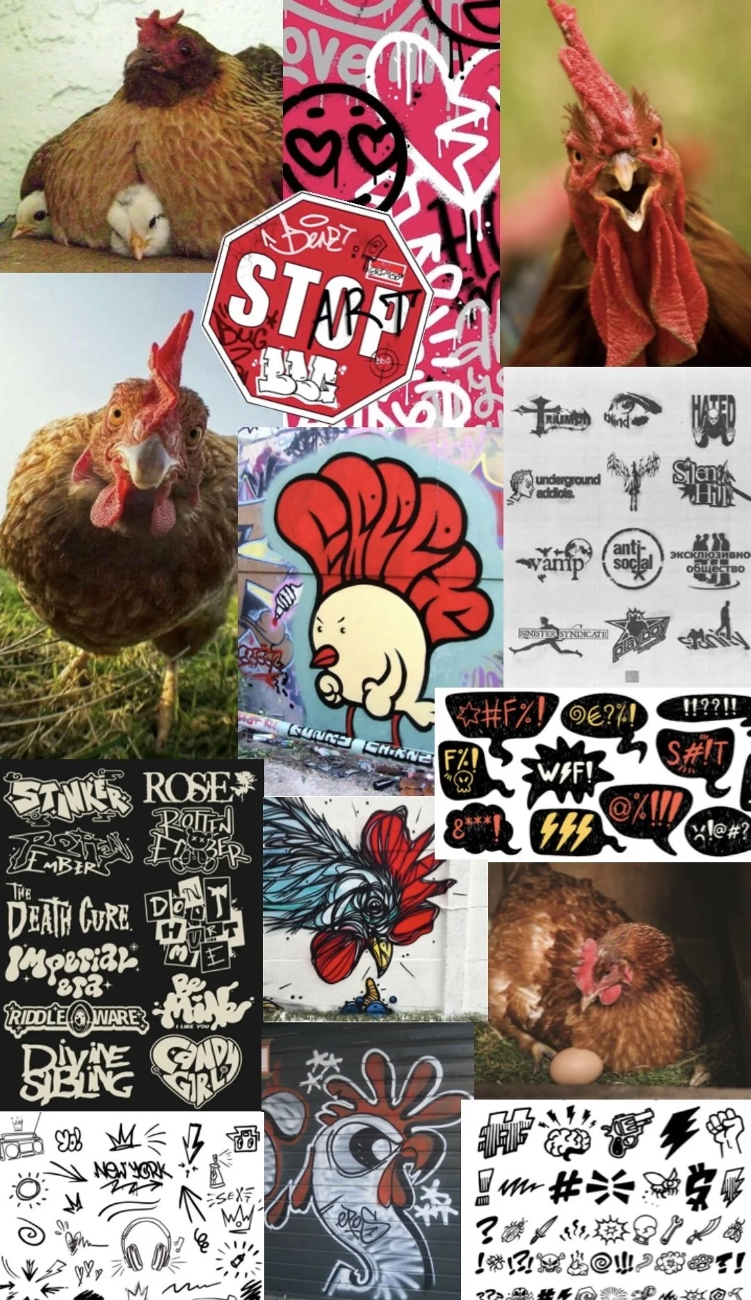
The core of all the research I did was regarding the aesthetic I wanted to go for. At first, I made a mood board (seen on the left) that focused more on a graffiti-like style for the brand overall given this food-truck is located mainly within Brooklyn, New York and other bustling areas of city life. Throughout my project’s development however, I leaned more towards a general off-set line art and overlapping style of elements often seen in both graffiti and sticker collages. This unique combination of aesthetics within in New York City and the surrounding areas are conveniently both also considered forms of street art.
I quickly found this vision of referencing both graffiti and sticker-collages linked to my brand identity perfectly. This is because the term “Broody Hen” is used commonly for a female chicken who is so intensely protective of the eggs she’s protecting that she becomes uncharacteristically aggressive and snappy. This attitude that the hen has during this time in her life is unpredictable, all-over-the-place, and chaotic, much like the visuals street art often has.
Along with all of this, I wanted to make a food truck that stood out among the rest. I researched what current food trucks look like and what I could do to make my design stand out more than the rest. The biggest thing I saw was to make use of warmer colors, which makes sense because it has been proven that warmer colors often make people hungrier than cool colors. I also saw a lot of patterns and busy designs, likely used to catch the customer’s attention. If not patterns or crazy visuals, a lot of food trucks were simply solid and very saturated colors, again, all to attract the customer. For my truck, I wanted something not too chaotic that it didn’t make any sense but something also visually appealing enough that I know it would make someone notice and be curious enough to check it out.
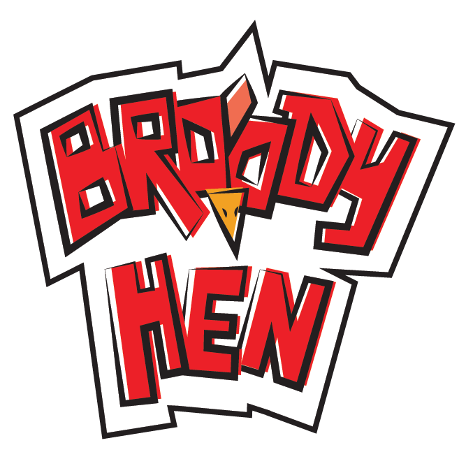
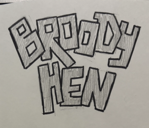
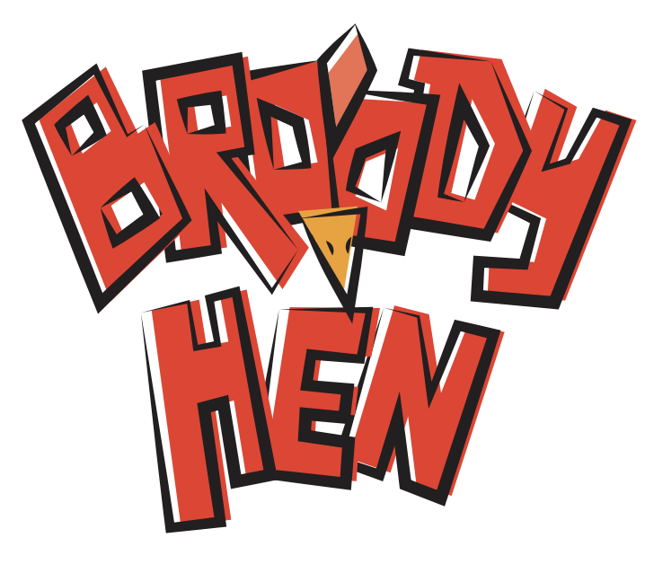
LOGO PROCESS
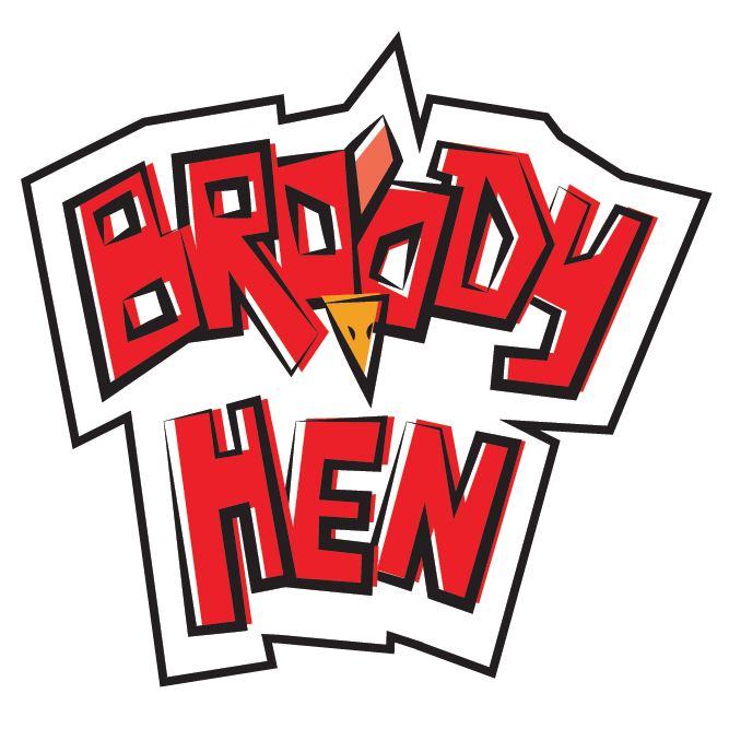
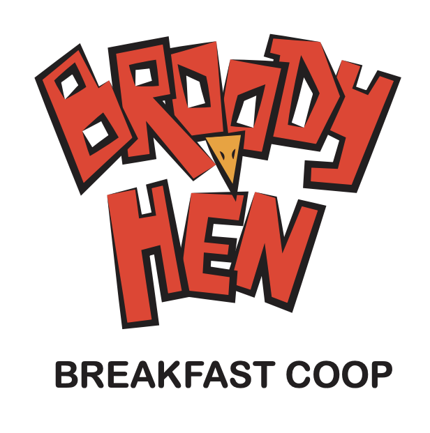
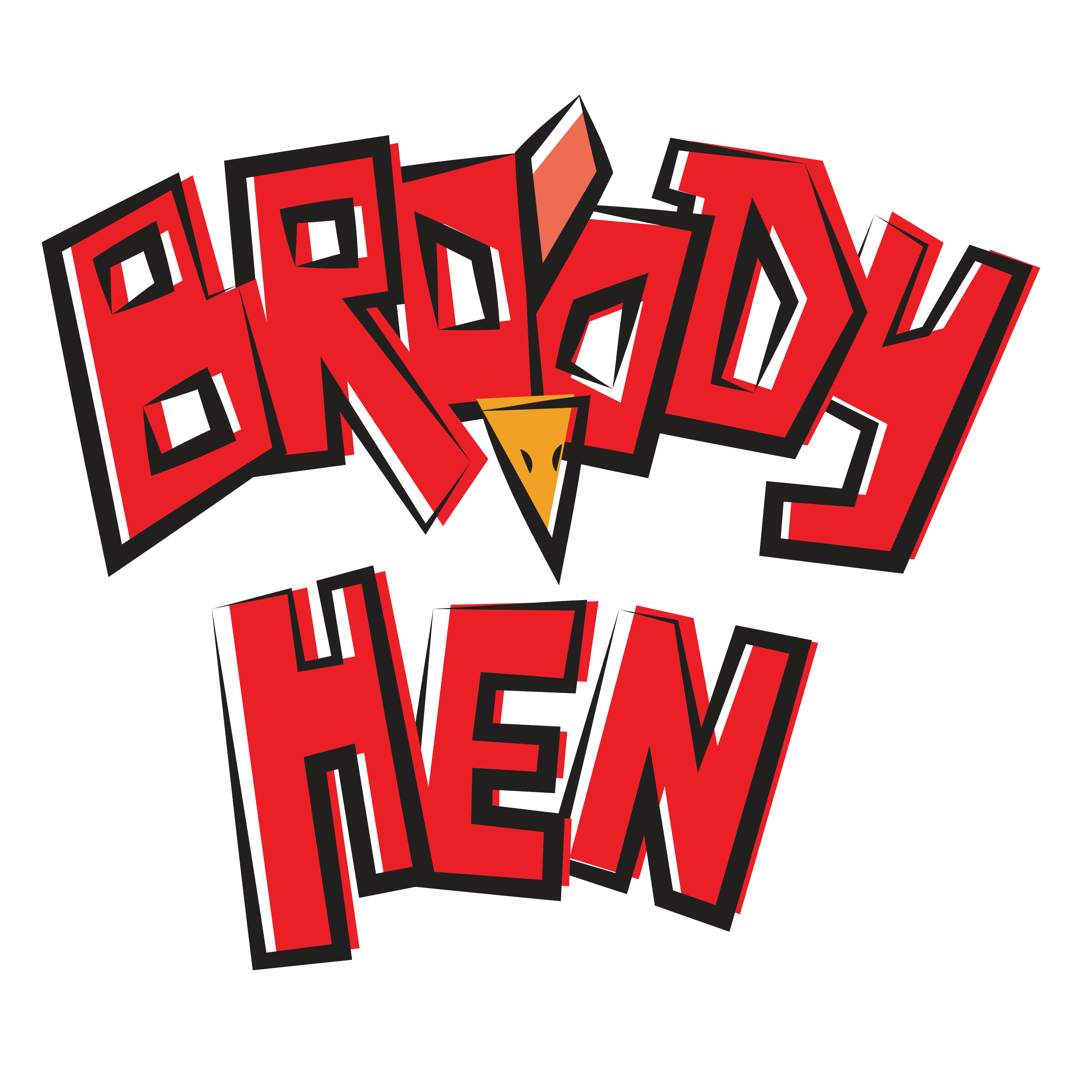
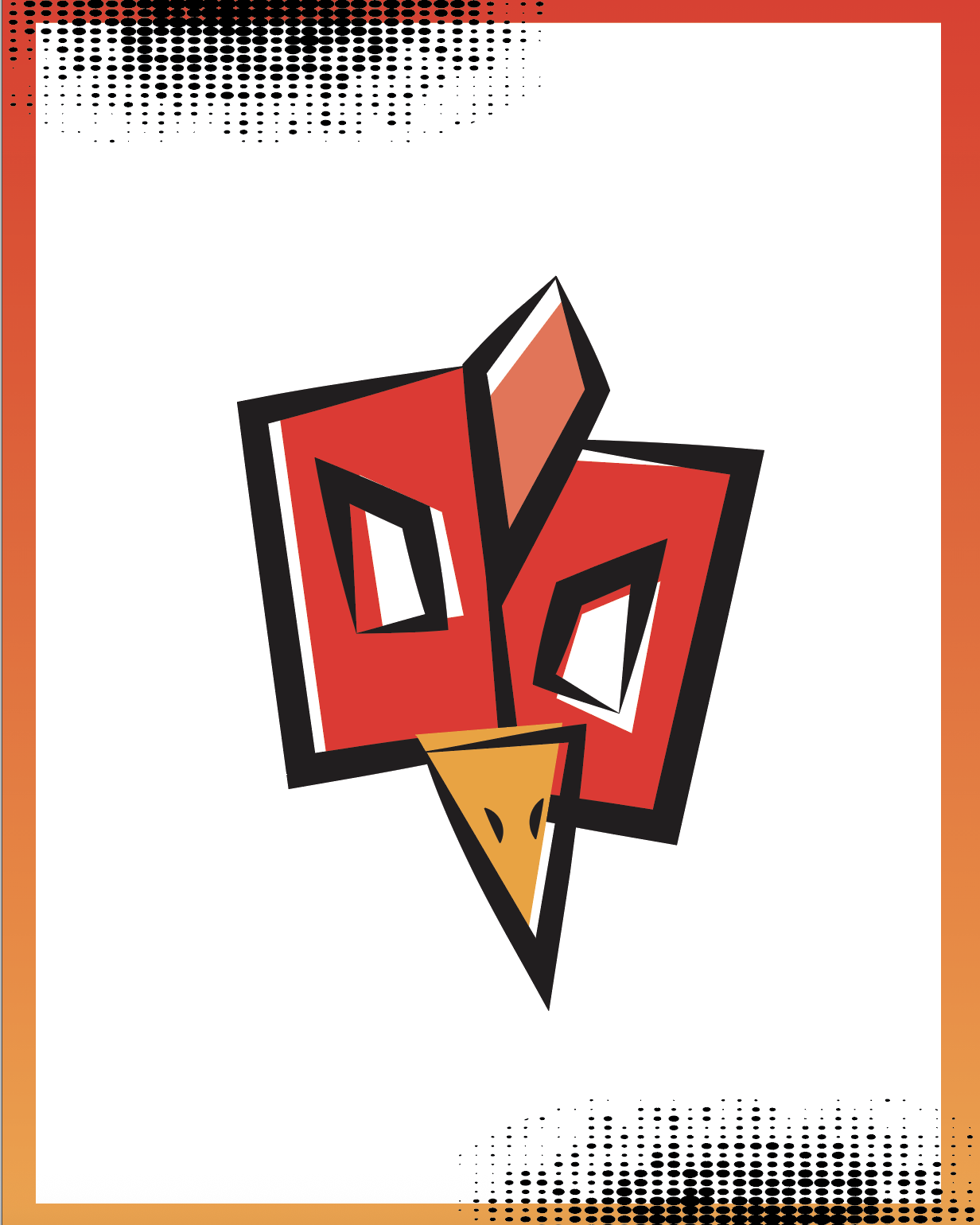
For my logo, my initial design was inspired by expressive typography seen often in graffiti. This is shown within the letterforms by referencing the overlapping styles commonly seen in this style of street art. As for my final design, I wanted to utilize that off-set line art style that is a staple of graffiti art. However, I did not focus entirely on a graffiti style in the end. While I referenced the off-set line art aesthetic, I added the white border element often, seen with stickers. The logo is used in certain instances across the elements sometimes with the white border and sometimes without.
The term “Broody Hen” is used as the name for the brand because not only are chickens often a symbol for the morning and breakfast-time, a broody hen is a female chicken who is so protective of the eggs and young chicks she is responsible for that she gets aggressive, chaotic, and snappy. This vision of a chicken with attitude was something I wanted to emulate within the word “broody” itself. Due to this, I took the two “O”s in the word “broody”, added a chicken’s beak and comb, and ended up with a grumpy chicken face to further link to the fact that my brand’s name is in reference to a female chicken.
FINAL LOGOS
FOOD TRUCK
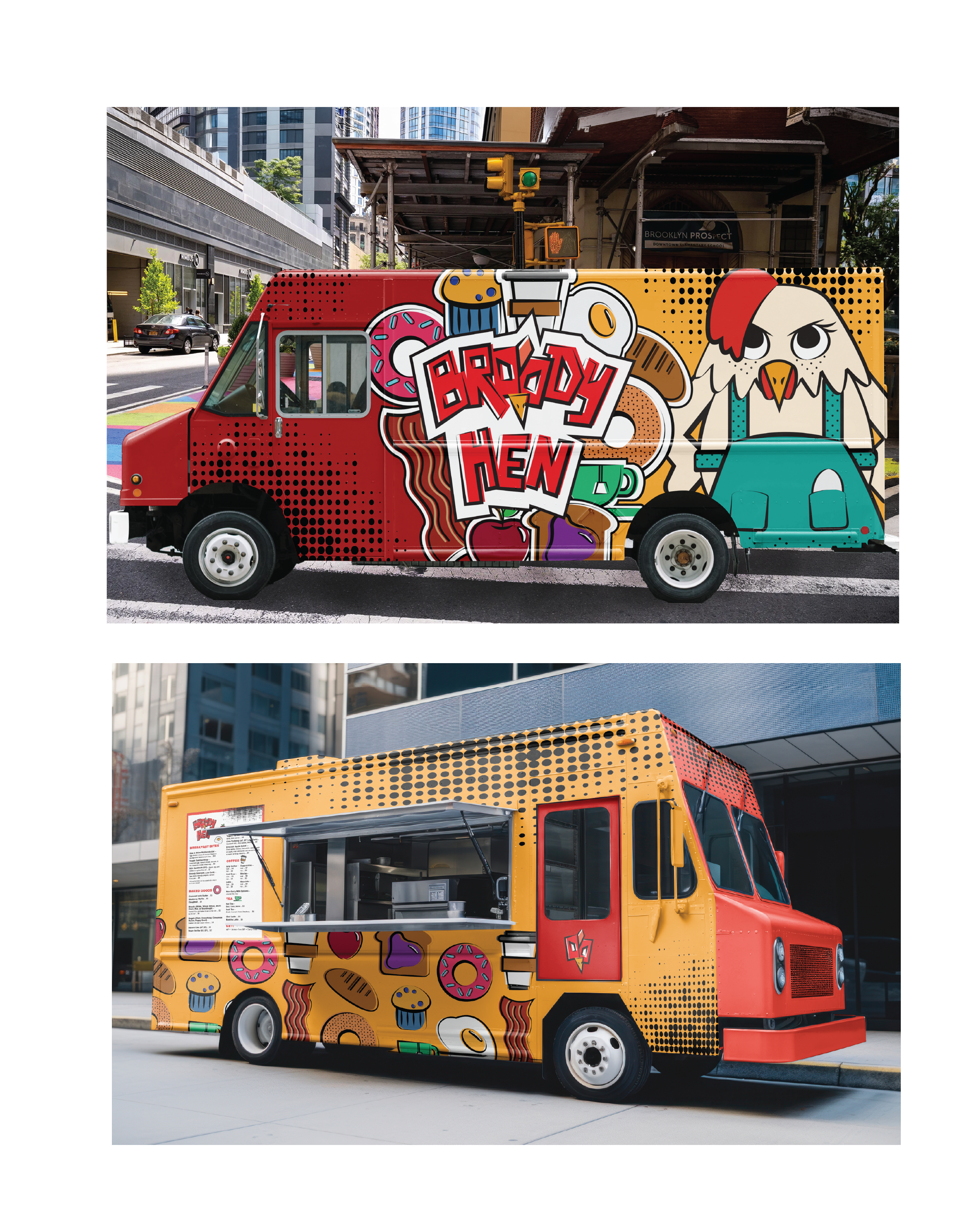
For the food truck itself, the design seen on either side of it is the culmination of miscellaneous branding elements. These elements include half-tone patterns, a collage of the logo as well as icons of various food items, and the mascot. The side of the truck without the service window has more of these elements given the larger surface area that can be used for branding. The side of the truck with the window features a pattern made of the icons representing foods, a menu, and the halftone patterns with the “chicken-face” symbol on the door.
The chaotic nature of these design choices are linked back to how unpredictable a “broody hen” can be. It also is purposely chaotic given this food truck frequents the streets of Brooklyn and New York City so it is necessary that it stands out against the competition.
The collage element links to my intention of utilizing the “sticker collage” aesthetic while the halftone patterns are included across the truck and other deliverables due to the mascot having freckles and polka-dots on her apron.
OTHER BRANDING ELEMENTS
Other elements featured across the brand besides the logo are the mascot, food icons, and collage. These all play a crucial role in unifying the brand’s identity.
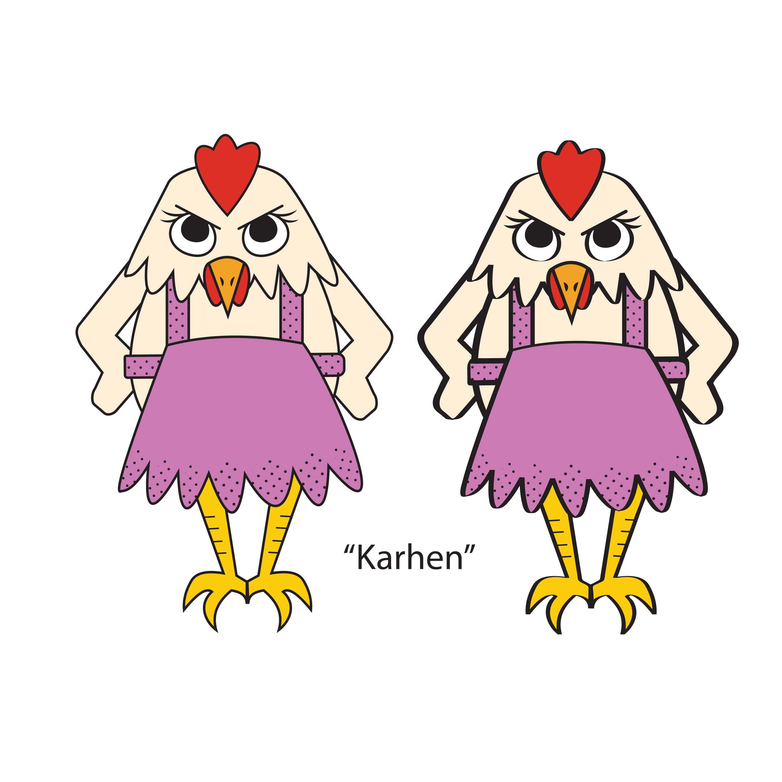
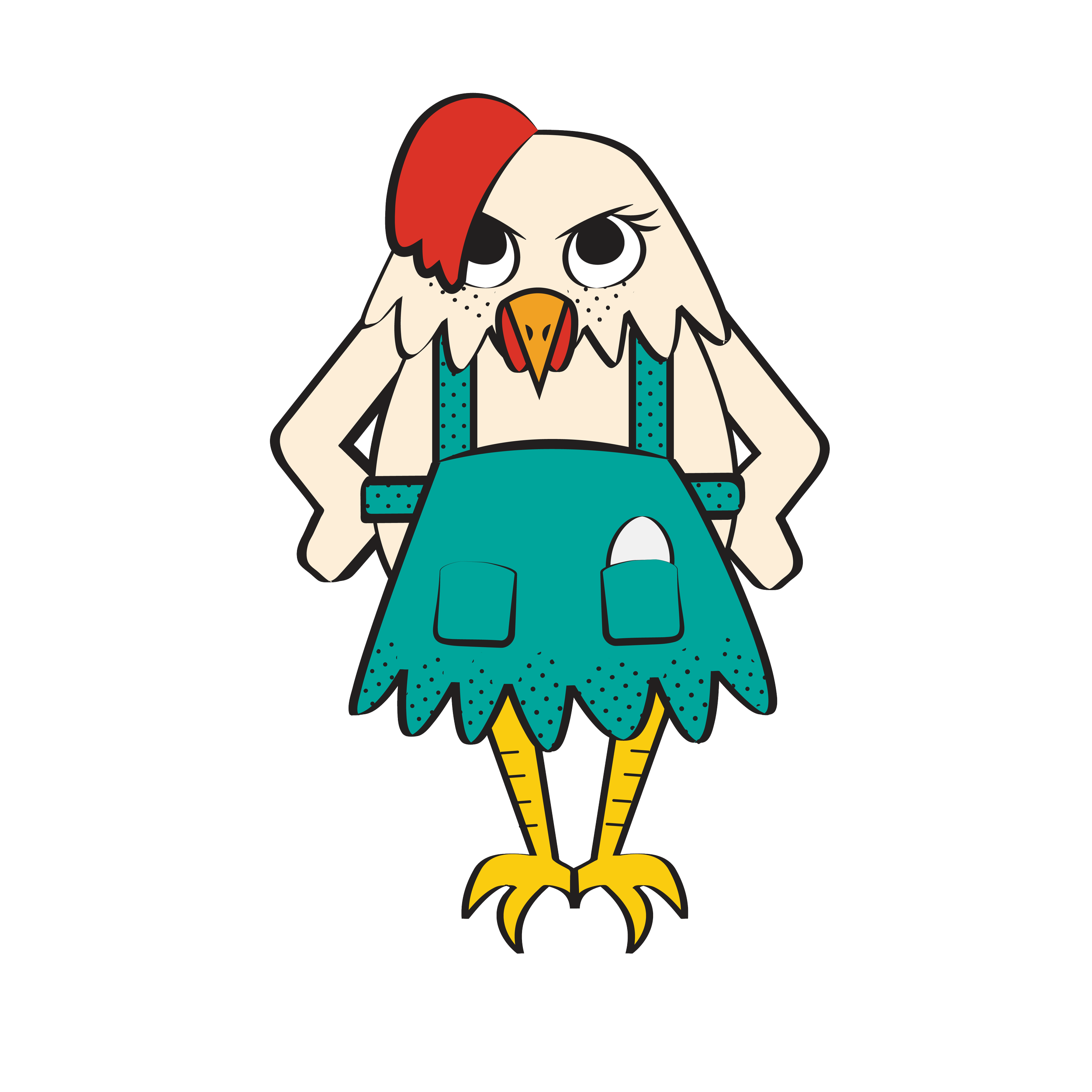
THE MASCOT: “KARHEN”
Karhen is the sole mascot of the “Broody Hen” brand, leading her to be a secondary branding element. She’s the embodiment of the maternal figure that everyone goes to for help when needed but people need to remember that she isn’t just a friendly, motherly face. She will not hesitate to stand her ground and be bluntly honest if something is not up to her standards.
The design for her having an apron is a nod to the trope of the “mother hen”. This is further seen in how she has an egg within one of her apron pockets, alluding to how protective she is of her young. Her comb being brushed off to one side however is in reference to the stereotypical “Karen” haircut. This was a style of haircut that became infamous around 2014 for the connection with ill-mannered women who were perceived as entitled, demanding, and often aggressive.
FINAL DESIGN
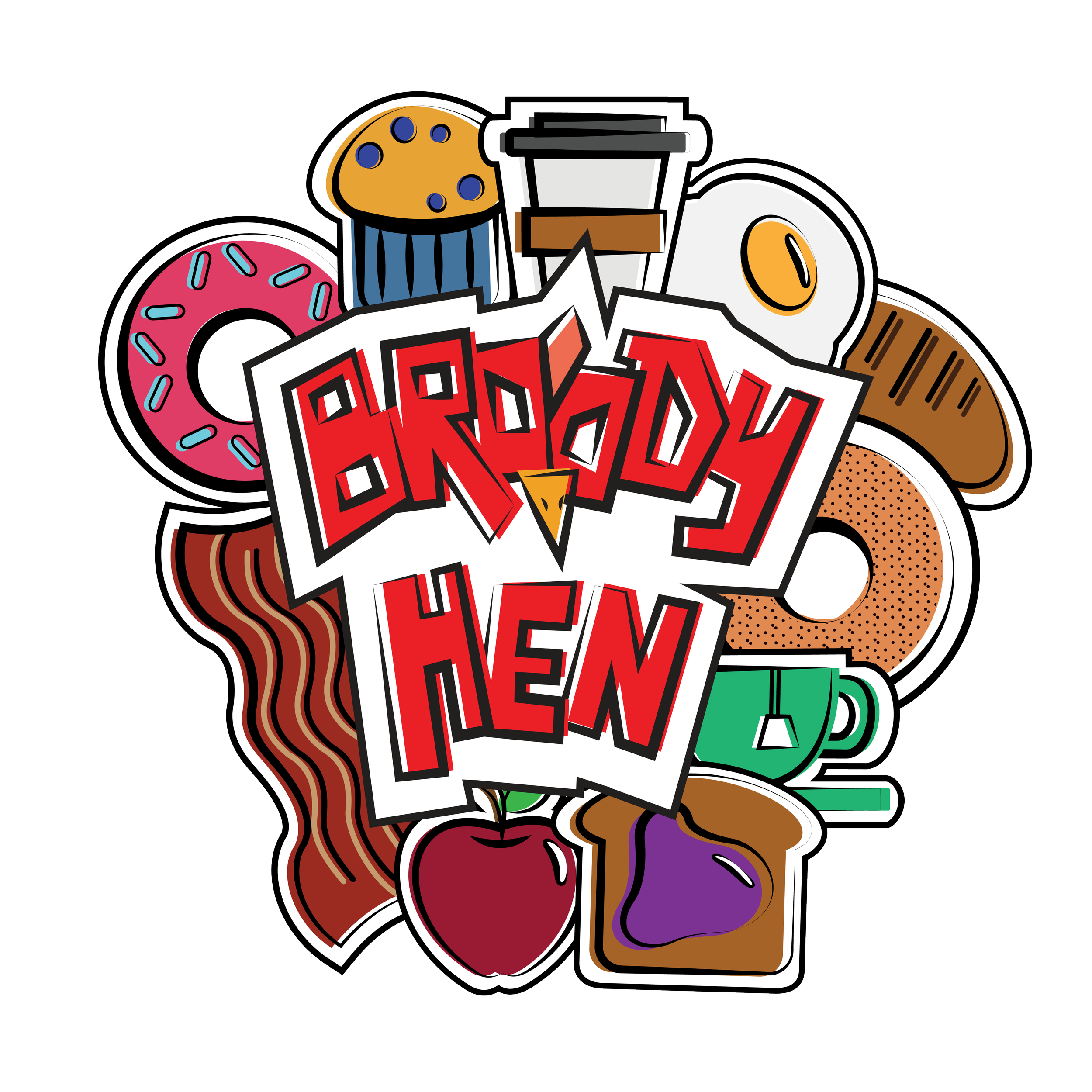
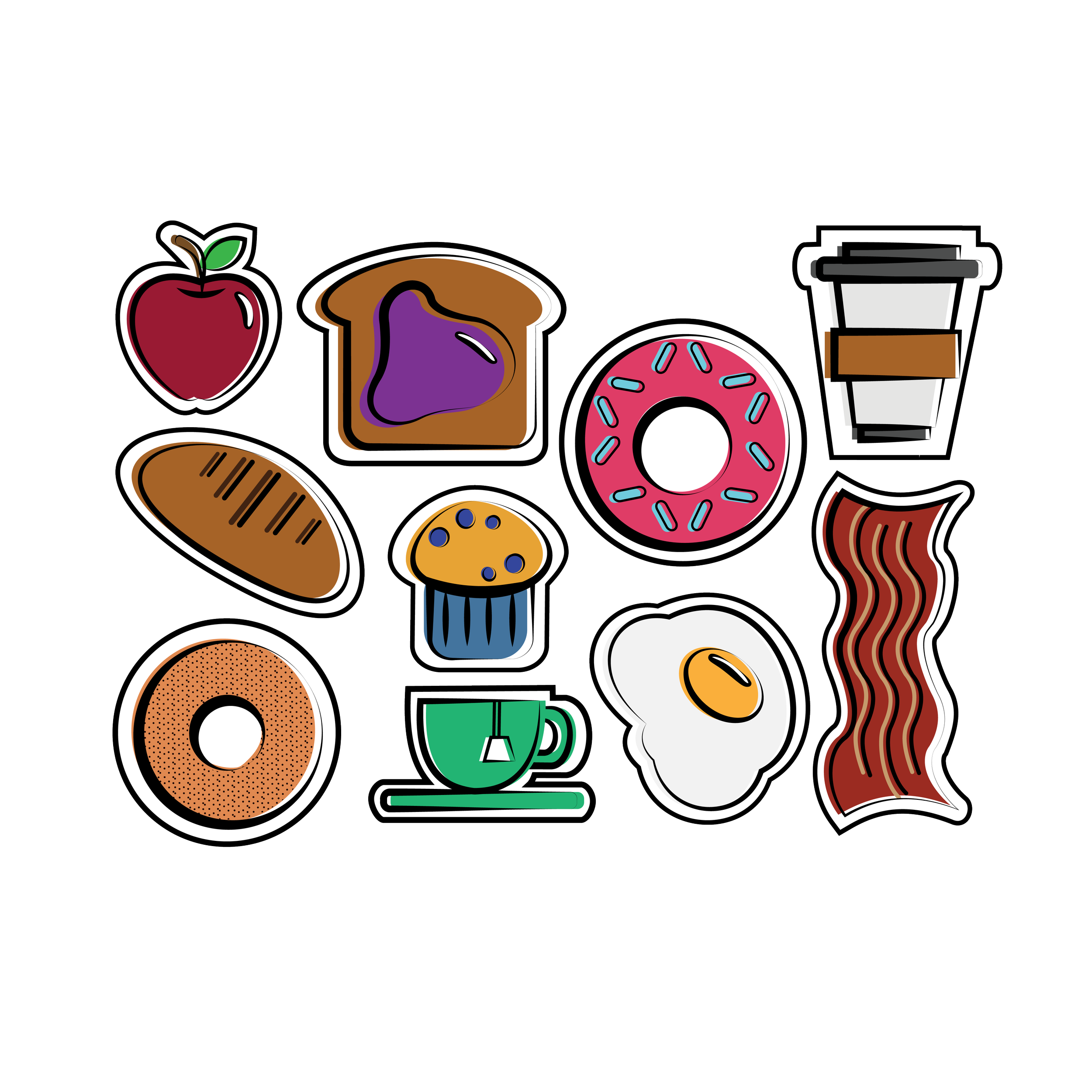
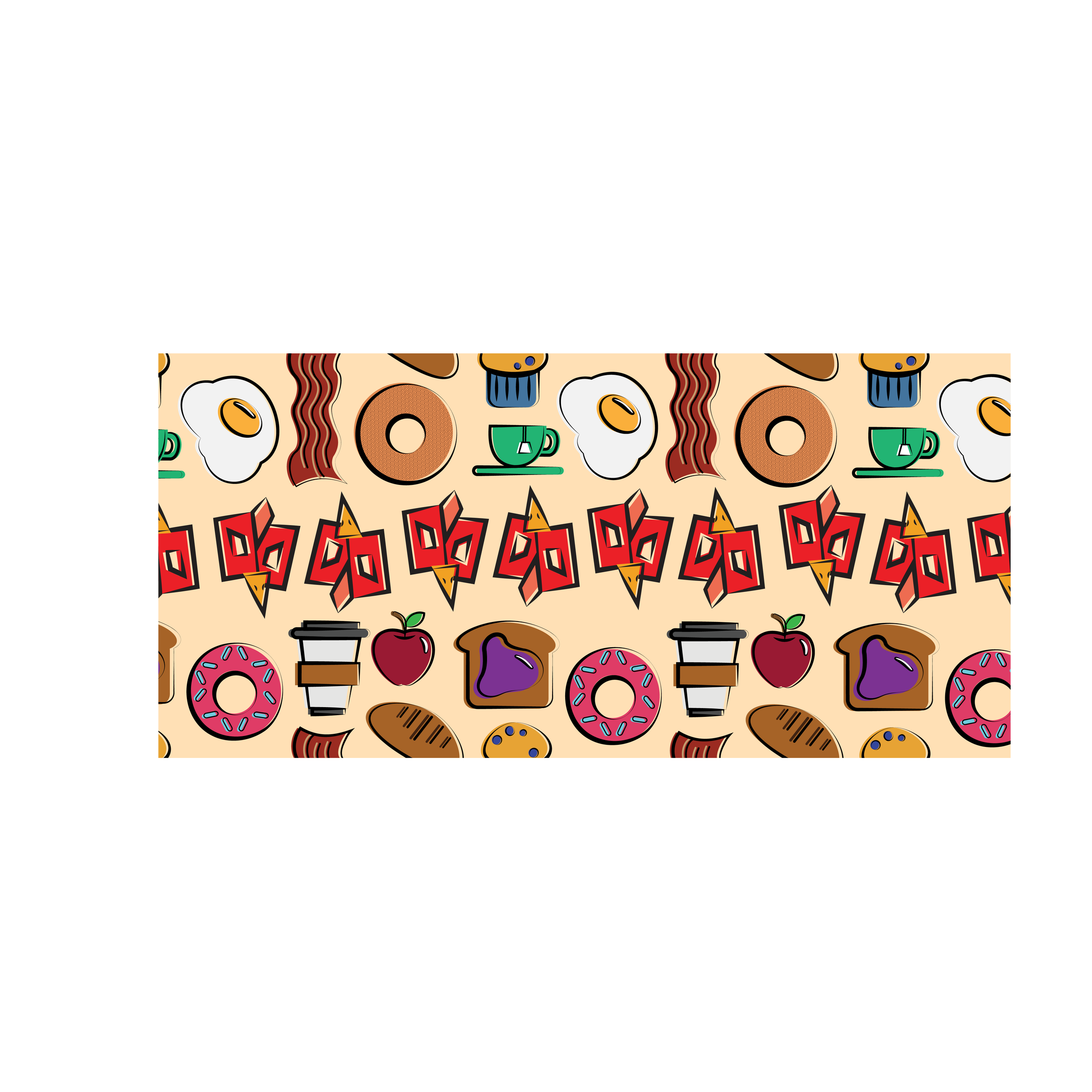
FOOD ICONS AND COLLAGE
The icons of food and the collage of those icons plus the logo are tertiary elements. These icons are representative of only a few food and drink items that Broody Hen has to sell to its clientele. The collage is build up out of these icons, the icons stacked on top of one another referring to my intended secondary aesthetic of “sticker collage”.
The icons on their own make up varying patterns seen most often in my packaging while the collage’s main use is on the side of the truck itself alongside Karhen. The color choices for the icons were purely reliant on making sure that whomever sees the icons will immediately understand what the icon is meant to be and in turn would entice the viewer to check out the truck’s menu.
THE MENU
As this is a food truck, that naturally means there has to be a menu. There are two versions of the menu: 11 inches by 17 inches and 8 inches by 10 inches. Both versions include the same categories of food and drink items as well as same placement of food icons, logo, and halftone pattern.
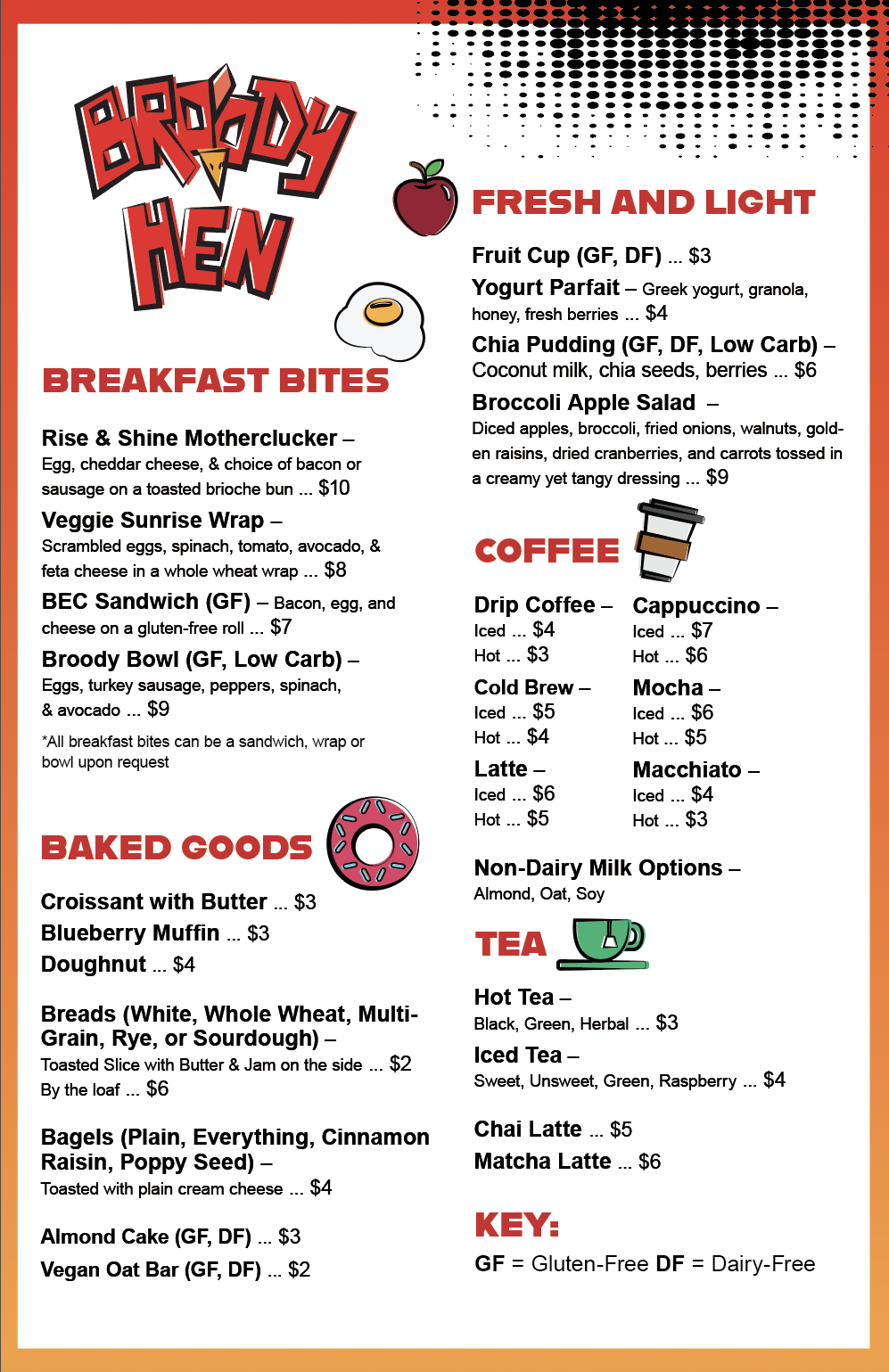
11 in ×17 in
The purpose of this larger format menu is to be stuck on the side of the food truck on the service-window side. This is so the people in line can view the menu options and make their decisions before they reach the window.
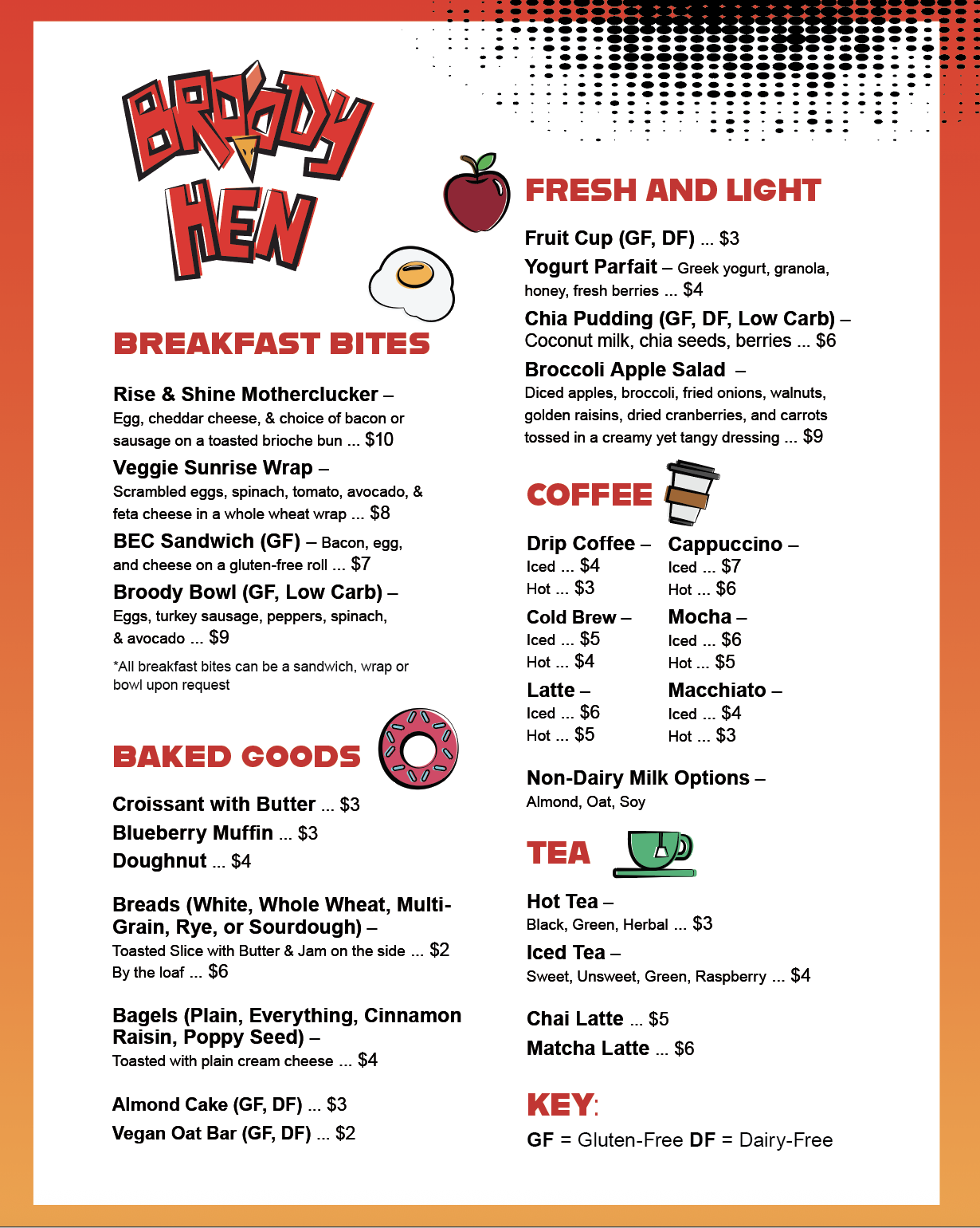
8 in ×10 in
The smaller edition of the menu is intended to be printed out and handheld. This specific version includes a design for the back of the menu, allowing people that may not be reading the front of the menu to be exposed to branding elements.
PACKAGING
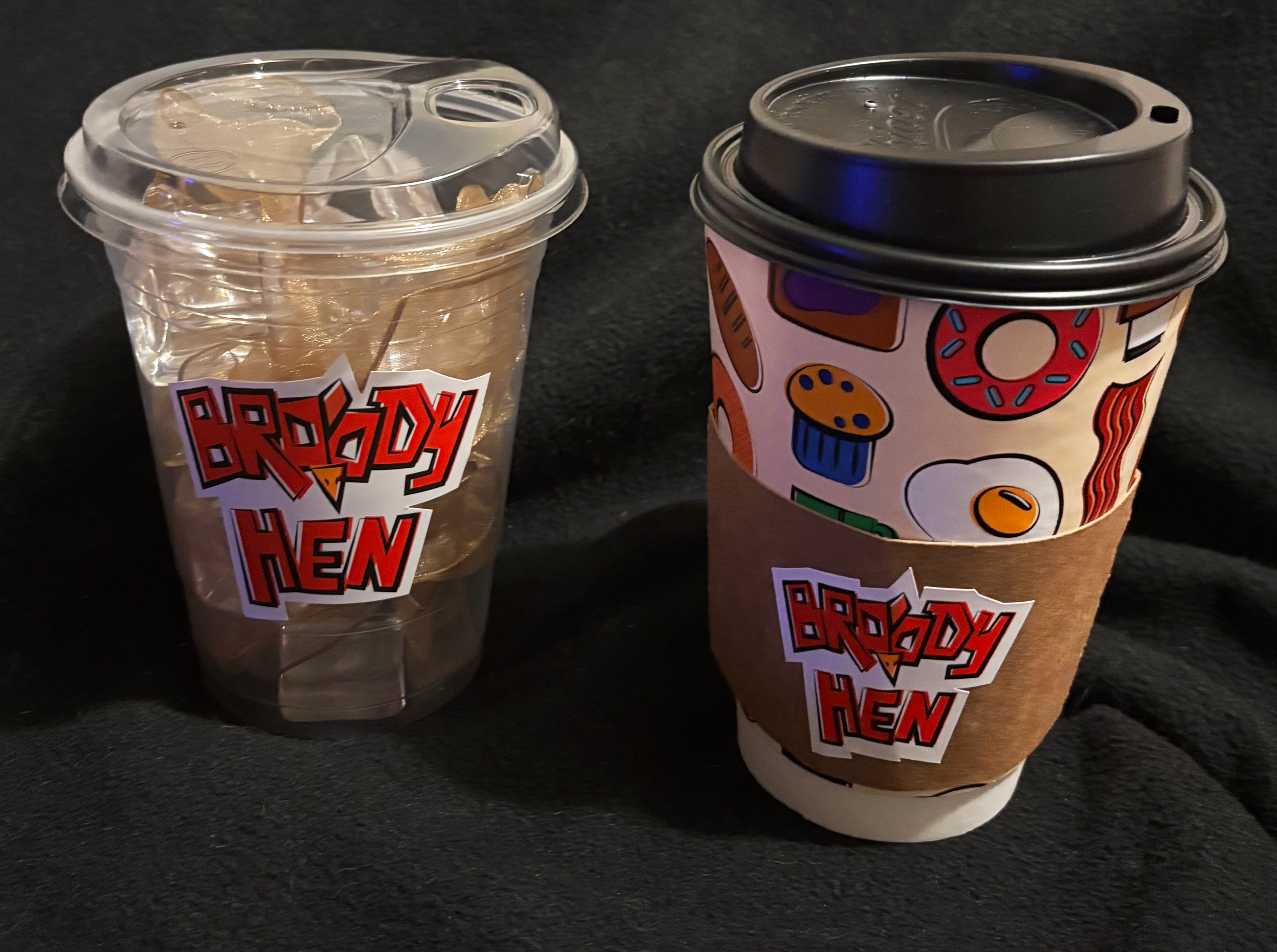
TO-GO CUPS:
Being a food truck means that Broody Hen specializes in convenience and on-the-go eating. Because of this it is a necessity to have forms of to-go packaging.
As for cups, Broody Hen has both hot and cold beverages available. The cold cup design is simply the Broody Hen logo as a sticker on either side of it. However the hot cup is more complex. The hot cup features a cup wrap consisting of a pattern made of all the food icons seen elsewhere. The hot cup also features a cardboard sleeve where much like the cold cup, the only branded element there is the Broody Hen logo.
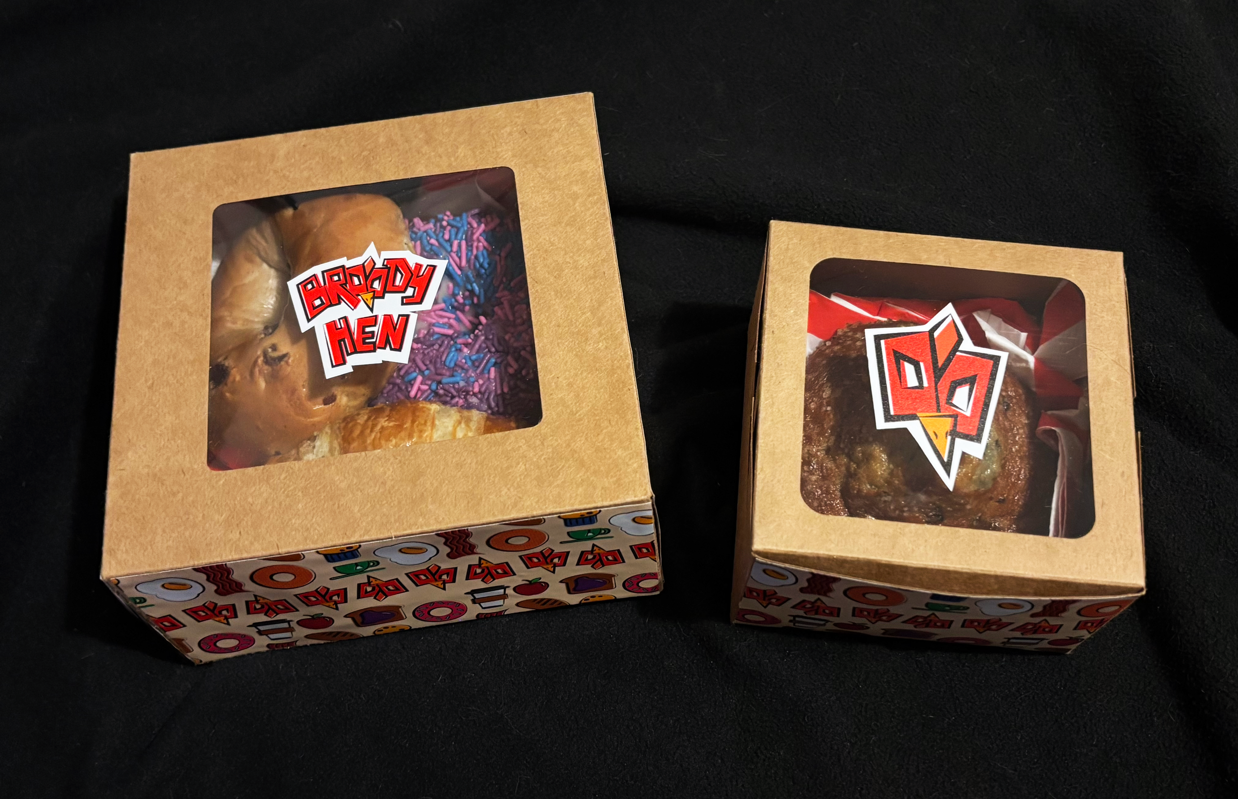
TO-GO BOXES:
Being a food truck means that Broody Hen specializes in convenience and on-the-go eating. Because of this it is a necessity to have forms of to-go packaging.
Starting with the boxes, there is a larger box meant for multiple items and then a smaller box for singular items. The larger box is branded with a pattern around all four sides and then the logo in the window on top of the box. The smaller box has a pattern on only the front and back with only the chicken-face symbol on the window on top.
Online Presence and Brand Guidelines
One part of being a food truck is to make sure our customers know the latest promotions and what events that the Broody Hen truck might be popping up at. Because of this, it is crucial that Broody Hen created an Instagram page.
Please check out the page to keep up with all the latest Broody Hen happenings.
WEBSITE
Along with the Instagram, the Broody Hen also has a website. The website features pages including the menu, a “contact us” form, as well as an “about us” page so people can further learn about Broody Hen and the people who help make it succeed.
GUIDELINES
It is of most importance that people who affiliate themselves in a marketing-manner with the Broody Hen brand that they adhere to the guidelines set in place. So that there is no deviation, the guidelines for Broody Hen have been linked below for ease of access.